
Last night, it was reported that J.P. Howell will re-sign with the Dodgers. According to reports, Howell will get 2 years, 11.5 million guaranteed, with a third year mutual option that becomes a player option if Howell makes 120 appearances in the next two years. The contract terms seem reasonable, given Howell’s great 2013 season. But, his 2013 season was a bit of an outlier. Whether or not the changes are real will determine if this contract will be worth it.
Here are Howell’s overall results (ERA- and FIP-) since he was converted to a reliever in 2008:
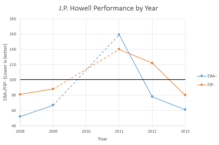
The first thing to note is the missing data from 2010. Howell missed all of that season with shoulder surgery. The second is the jump in ERA- and FIP- following the surgery. Lower is better on these numbers, and 100 (shaded darker) is league average. 2013 was the first season Howell was better than league average on both ERA- and FIP- since before the surgery.
So, what changed in 2013? First of all, Howell’s velocity increased:
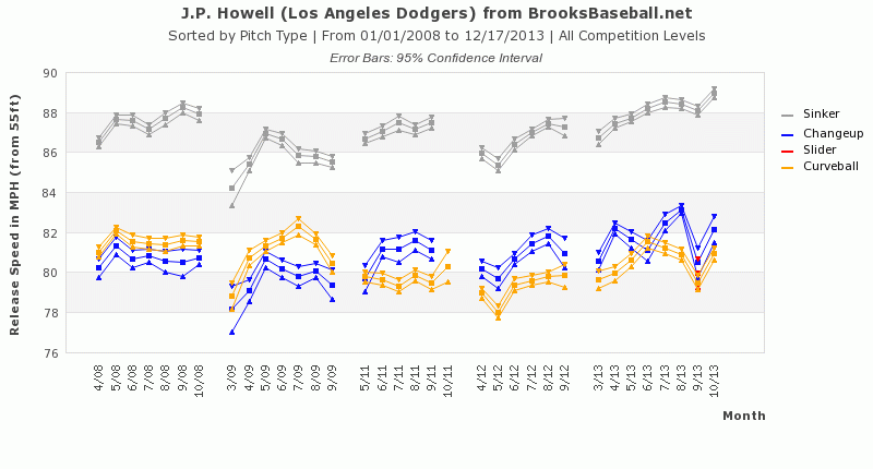
While Howell has never been a power pitcher, by the end of 2013 he was throwing his sinker faster than he ever has (or at least since Pitch F/X started tracking it). He also used it more than ever:
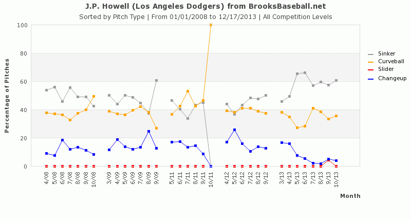
Overall, he threw his sinker 58.55% of the time in 2013, up from a maximum of 50.18% in 2008, and a post-surgery maximum of 44.59% in 2012. He began phasing out his change-up almost entirely, and he lowered his curveball usage as well. When the sinker was put into play, it was a ground ball 62.3% of the time, the highest groundball rate on that pitch of his career (up from a previous high of 56.76% in 2011).
The other interesting change that I found was on Howell’s release point:
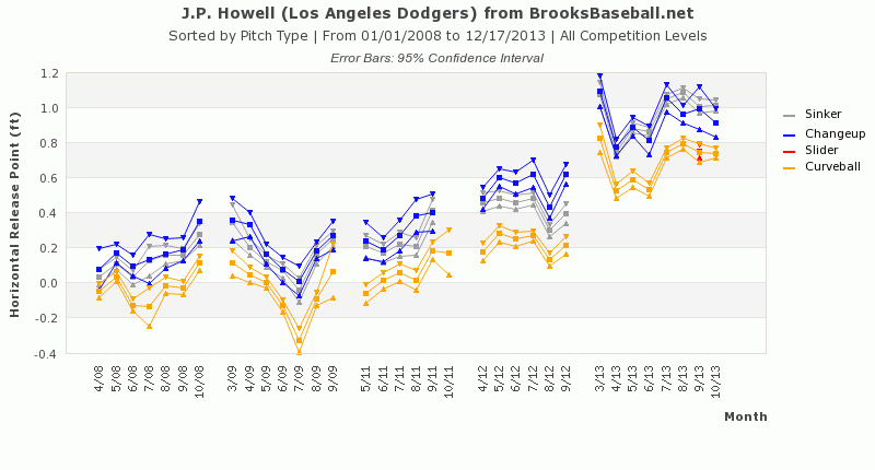
The chart shows a shift of release point towards the first base side of the rubber. I wanted to see if this due to a change in arm slot or a change in rubber position (or both), so I did a back-to-back comparison. Luckily, Howell pitched in Toronto in both 2012 and 2013 (same centerfield camera), so I was able to get a fairly close comparison:
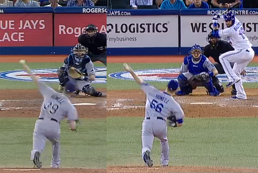
You can see that Howell is standing more towards the first base side. His arm slot is about the same; the Dodger frame is a few milliseconds behind the Rays frame. While not dramatic, it represents a small mechanical shift between 2012 and 2013.
One of the biggest changes in Howell’s results this year was that he limited homeruns. He allowed only 0.29 HR/9, and a 4.6% HR/FB ratio. Part of that could be due to the improved velocity and higher groundball rate on his sinker, but I did some additional investigation.
Below is a chart, using input data from the BrooksBaseball Pitch F/X location data. Instead of plotting the usage over each year, I took the output data and charted out the change in distribution from 2011-2012 to 2013. A negative number indicates that there are fewer pitches being thrown in the area, and a positive number indicates that more pitches being thrown in the area. The inner black box is the strike zone, and the chart is from the catcher’s perspective. The units are in change in percentage.
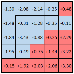
The takeaway here is that he’s throwing fewer high pitches and more low pitches. Other than one square (high, off the plate on the left-hand side), Howell has reduced the count of pitches in all zones of the upper 2/5 of the charted area. Over the upper 2/5, he’s reduced the percentage of pitches by 8.82%. Over the lower 2/5, he’s increased the percentage of pitches by 12.43%.
This change would probably limit fly balls and fly ball distance to a certain degree, so it leads me to believe that Howell’s reduced home run rate is partially real. While the HR/FB ratio will probably increase, if Howell continues to pitch towards the bottom of the zone, his HR count should remain lower than it used to be.
Howell improved in 2013, and it looks like more than luck. What about the deal itself? To me, this seems like it’s a bit below the market rate for good but not great relievers. Joe Smith is right-handed and got three years and 15 million from the Angels. Howell had a better year in 2013, but Smith is probably a bit better overall. Last week, Boone Logan(another lefty) got three years and 16.5 million from the Rockies, despite the fact that Logan is more of a situational reliever than Howell.
Given those two deals, the contract for Howell seems just about right. It rewards Howell for the strides he made in 2013 without breaking the bank or giving him too many years. Going into the offseason, I was convinced that Howell was going to get three guaranteed years, so this seems like a win for the front office.
Update
Commenter JackedNate suggested that the change in pitch location distribution could be due to the simple fact that Howell threw his sinker more. This makes sense, so I decided to re-run the above strike zone distribution change map using just the location of the sinker:
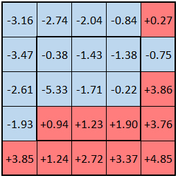
Surprisingly, the magnitude of the strike zone shifts is higher than the plot with all of his pitches. This means that Howell did a better job of getting his sinker lower in the zone in 2013 than he did in 2011-2012. In the upper 2/5 of the plot, he reduced the number of pitches by 15.91%, and in the lower 2/5, he increased the number of pitches by 21.92%.